Gentle Touch Midwifery
This project was to create and implement new branding for Gentle Touch Midwifery. The solution takes inspiration from primary midwife Eudine Stevens’ experience as a masseuse by emphasizing gentle curves to evoke a sense of peace and security. The symbol is built from delicate line work to illustrate the careful action of the hands cradling around the heart. The heart represents both the mother and child, as well as the holistic care for both while reducing visual complexity of the solution for maximum impact and ease of use.
The deliverables included logo assets, stationery kit, educational flier templates, and branding standards guide.

Primary Solution
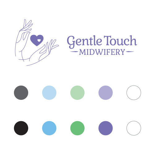
Horizontal Variant & Color System
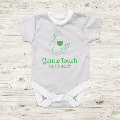
Promotional Apparel
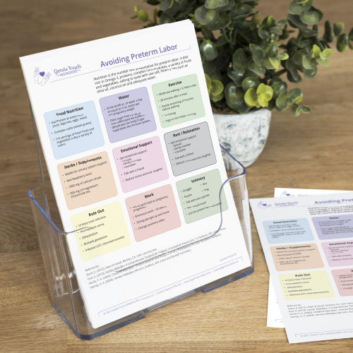
Educational Flier Templates
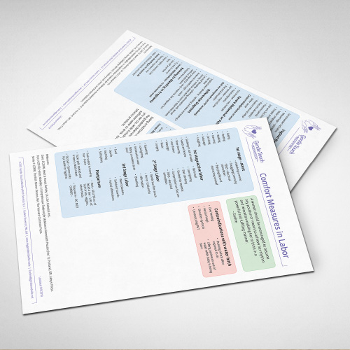
Educational Flier Templates
