Sunrise Midwifery
I was hired by Sunrise Midwifery to better align their branding with their target demographic. The objectives were clear – draw inspiration from the existing branding but modernize it with bright, bold approach while avoiding typical clichés such as a torso silhouette, babies, and a pastel colors. I accomplished the objectives by leveraging a vibrant palette, utilizing a visual analogy of the flower petals sun, and paired strong feminine type with light, clear type for maximum legibility.
My contribution – I handled this project from concept to completion, working directly with the business owner to modernize the brand and implement across a variety of mediums.

Primary Solution
Legacy Branding
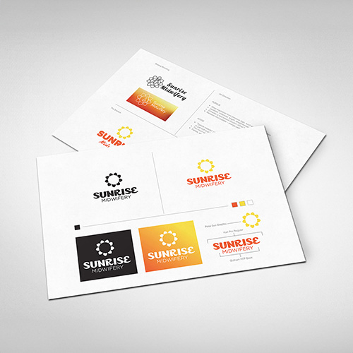
Brand Guidelines
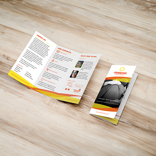
Services Brochure
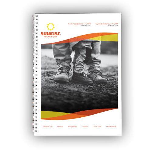
Client Booklet
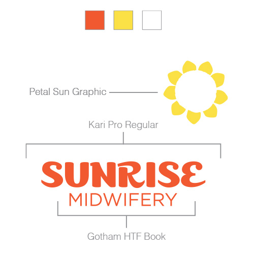
Logo Elements & Palette
